
Sticking to my theory of consistency and quality– I did the Warner Loop again tonight after work. I was fortunate to hit a few lights just right which allowed me to the opportunity for two good long intervals. The intervals were 16 minutes and 29 minutes long. My training goal was to find my new threshold number. My lack of training has lowered my Functional Threshold Power (FTP). I think I am more around 260 watts (3.95 w/kg) instead of 280 watts (4.25 w/kg) as I had it set for before.
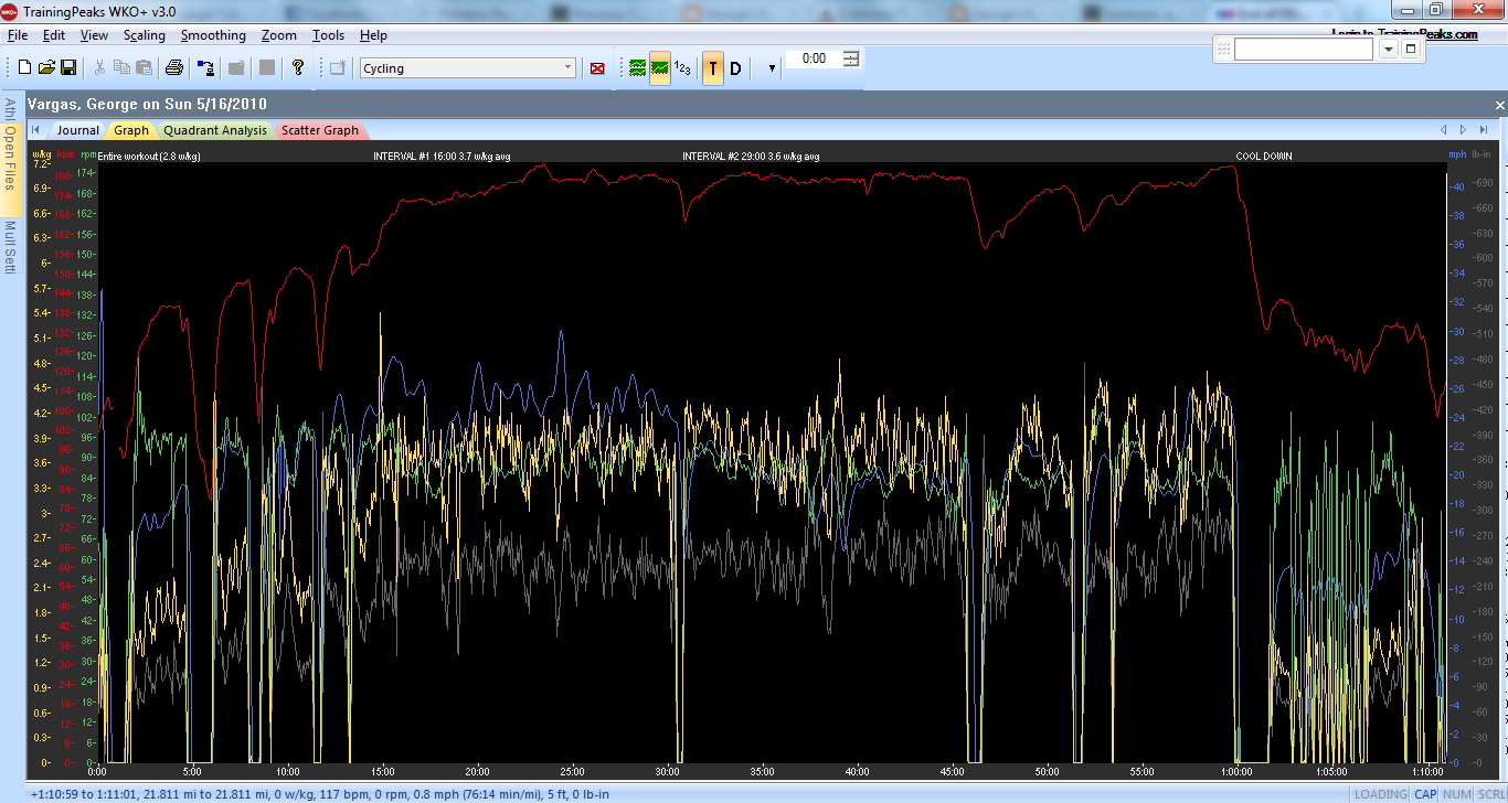
Entire workout including warm up, two intervals and cool down

Data for entire workout
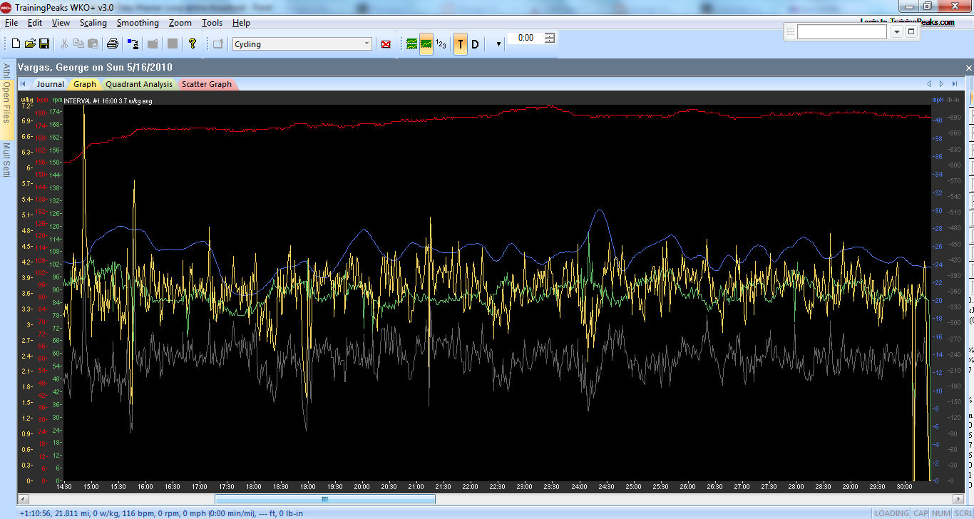
Interval #1- 16 minutes 3.7 w/kg avg.

Data for Interval #1

Interval #2- 29 minutes 3.6 w/kg avg. Three traffic signals caused the noticeable drops in power.

Data Interval #2
I have included a graphic below with data derived from Training Peaks. It shows your recent weeks and recent months activity. As you can see there is a significant decline in hours of training, miles, TSS and Kjs in the last couple of months.
Hours and miles are self-explanatory. TSS or Training Stress Score — think of it as a rating system of your rides. If you ride at your FTP for one hour then your TSS would be 100. So the closer the intensity is to your FTP the higher a score or TSS you will receive for your workout. Kjs — easiest and less complicated description is the amount of work or calories expended.

Another way to look at your training graphically is through the use of the Performance Management Chart provided by Training Peaks Software.
Pink– Stress put on your body over the last 7 days
Blue– Cumulative Stress put on your body over the last 42 days
Yellow– The amount of recovery you are giving your body.
You will notice that the peaks on the Pink line are on 4/17, 5/1 and this week. 4/17 was the Mount Laguna Bicycle Classic 5/1 was Breathless Agony. I didn’t ride in the two weeks in between each of those events hence you see a spike and then a long decline on the Pink line and a sharp ascent on the Yellow line depicting rest, recovery and um…no motivation to train. So while my legs were well rested they were too rested and I lost lots of fitness.
The Blue line is trending down so much it looks like the Stock Market is crashing 😉

Performance Management Chart from April 11-May 16
Now let’s compare the above Performance Management Chart to chart covering the first part of the season when I was motivated to ride and train. The PMC below shows graphically my cumulative stress (Blue line) rising steadily as I was increasing my mileage and intensity during my early season races. Notice also the HUGE spikes in the Pink line from my Brevets and Double Century. Now looking at the Blue line isn’t that a much better stock to own 🙂

Performance Management Chart from Feb 6-May 16
